Apollo Pharmacy App: Redesign
Redesigning Apollo 24/7 to improve healthcare accessibility for elderly users with visual and cognitive impairments.
00

problem
Apollo 24/7 — India's largest healthcare app — wasn't built for the users who need it most. For elderly people with low vision or cognitive decline, its complex navigation, low-contrast visuals, and multi-step flows made simple tasks exhausting, leading to missed treatments and heavy reliance on caregivers.
solution
An accessibility-first redesign built to WCAG 2.1 standards: simpler navigation, high-contrast visuals, and larger touch targets, plus persistent medication reminders and caregiver-assisted monitoring — so elderly users can manage their own healthcare independently and with confidence.
Project Overview
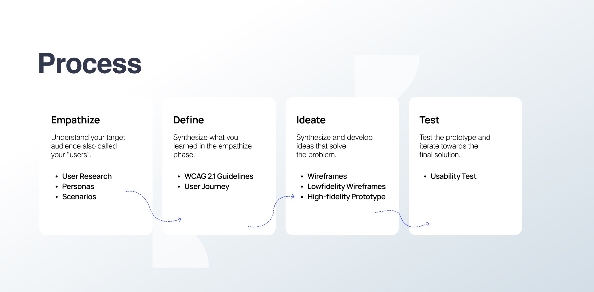
Who & why-
By 2050 the elderly will be a major share of the population, and many face visual impairment and cognitive decline at once — yet most health apps make core tasks harder. I designed for four conditions (mild cognitive impairment, Parkinsonian tremors/arthritis, cataracts/low vision, hearing loss), anchored by four personas: Meera, 65; Abdul, 70; Anjali, 68; Narendra, 72.
Before → after
Mapping five real tasks showed the shift: a medication refill that once ended in a call for help now takes under 30 seconds; a tele-consult that meant mis-taps on tiny buttons is booked by voice in under a minute; lab results once missed as silent alerts now vibrate, flash, and share in one tap.
The redesign-
Across Homescreen, Find Doctor, and Online Consultancy: high-contrast visuals, bigger icons and touch targets, voice input, grouped action cards, persistent reminders, and CTAs with real weight — cutting clutter and cognitive load at every step.
Outcome-
Tasks that once needed a caregiver were completed independently, faster, and with confidence.
year
2025
timeframe
30 days
tools
figma
category
UI/UX
01

02

03

04

05

06

07

08

09

010

011

012

013

014

015

016

017

018